Features Overview

Build A Better Nacho cross-merchandising campaign.
Build A Better Nacho cross-merchandising campaign
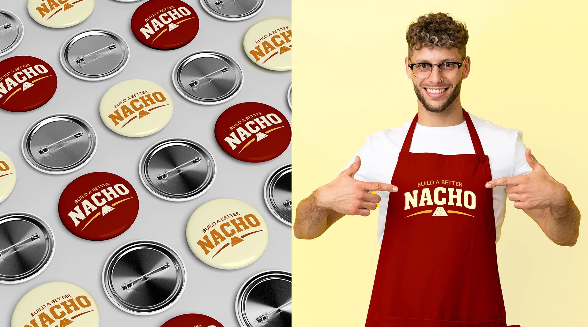
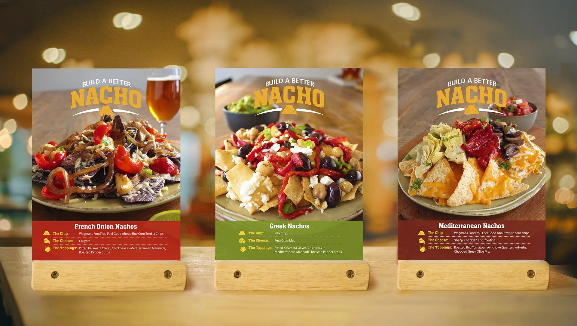
The Build A Better Nacho campaign was a cross-merchandising initiative developed for a national grocery chain along the East Coast. I led the design of a bold yet playful logo and visual identity aimed at engaging sports-minded, college-aged shoppers. Timed to launch during peak football season, the creative approach emphasized energy, fun, and in-store visibility. In addition to the logo, I designed a cohesive set of merchandising assets and signage to support the campaign across multiple retail touchpoints.
The Build A Better Nacho logo combines slab serif and sans serif typography to create a bold, approachable look tailored to a college-aged audience. A bitten-nacho icon adds personality while reinforcing the campaign’s theme.
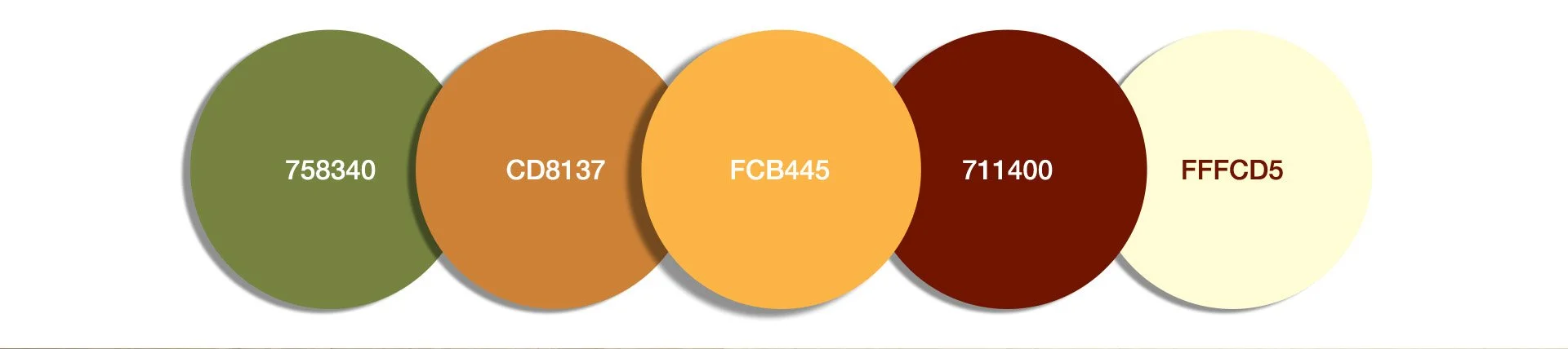
The color scheme was intended to be a bit dramatic to draw attention but not to over power the heroes of the pieces, which was the food.
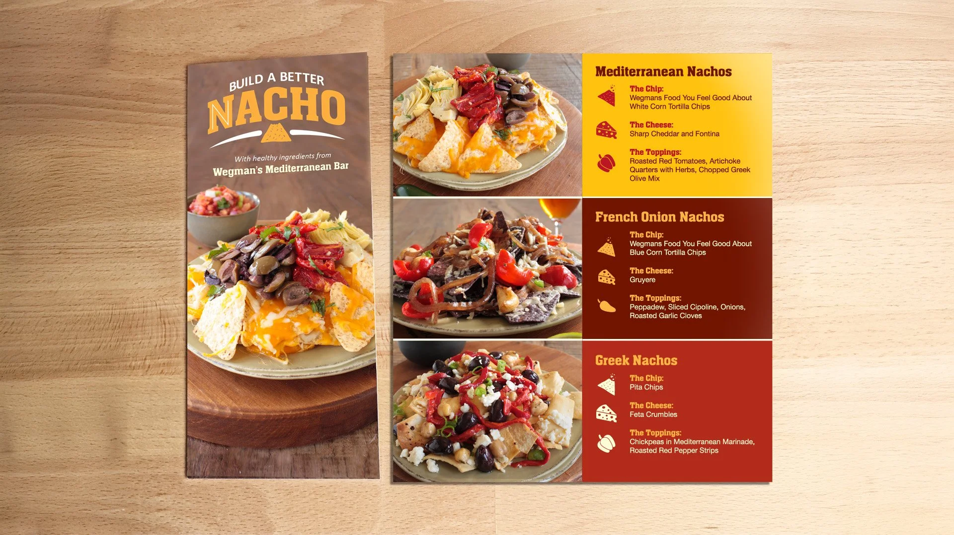
The brochure was a simple bifold with photography that I shot myself, with the aid of styling and lighting assistance.